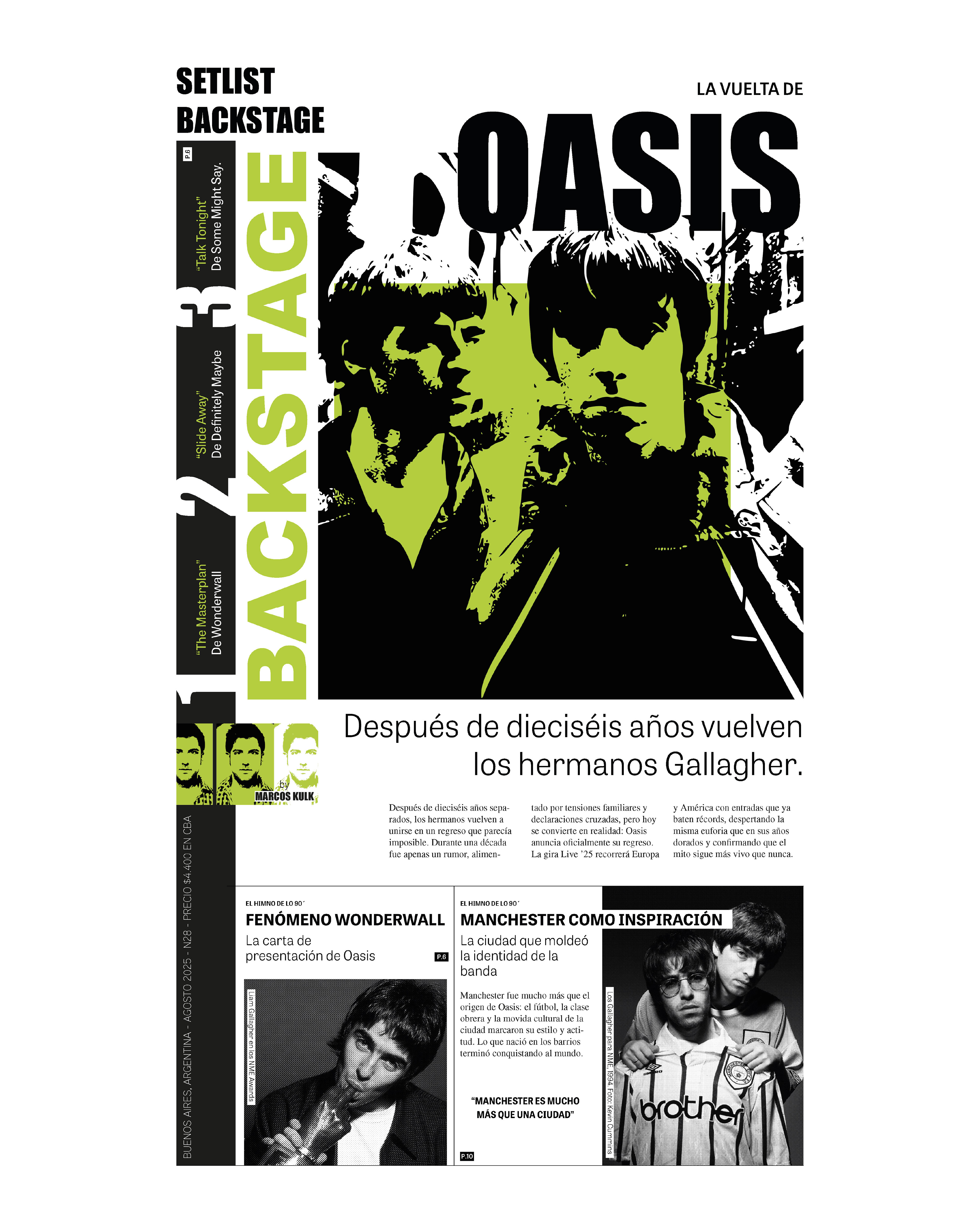
Editorial design project combining visual research, storytelling, and graphic design. Developed as a music magazine inspired by the British band Oasis, it explores their history, aesthetics, and cultural legacy through editorial, typographic, and photographic resources. The focus is on art direction, grid system, and building a visual identity consistent with the band’s universe.
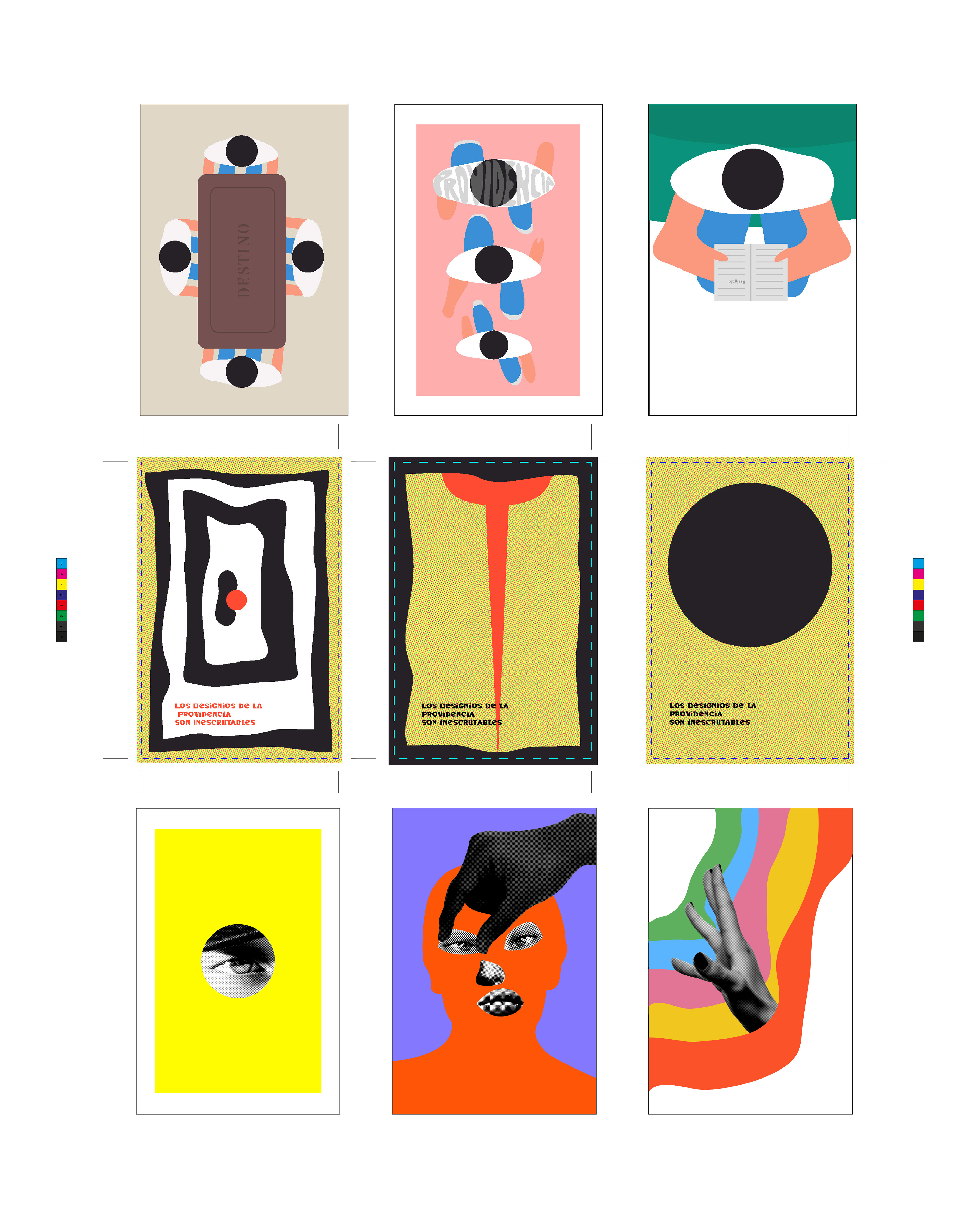
A series of conceptual postcards inspired by A True Story, a short story by Julio Cortázar.
The project explores fragility, chance, and the poetry of everyday life through visual composition and the symbolic use of color and form.
Each postcard works as an independent fragment, yet together they create an open and emotional narrative.
The project explores fragility, chance, and the poetry of everyday life through visual composition and the symbolic use of color and form.
Each postcard works as an independent fragment, yet together they create an open and emotional narrative.
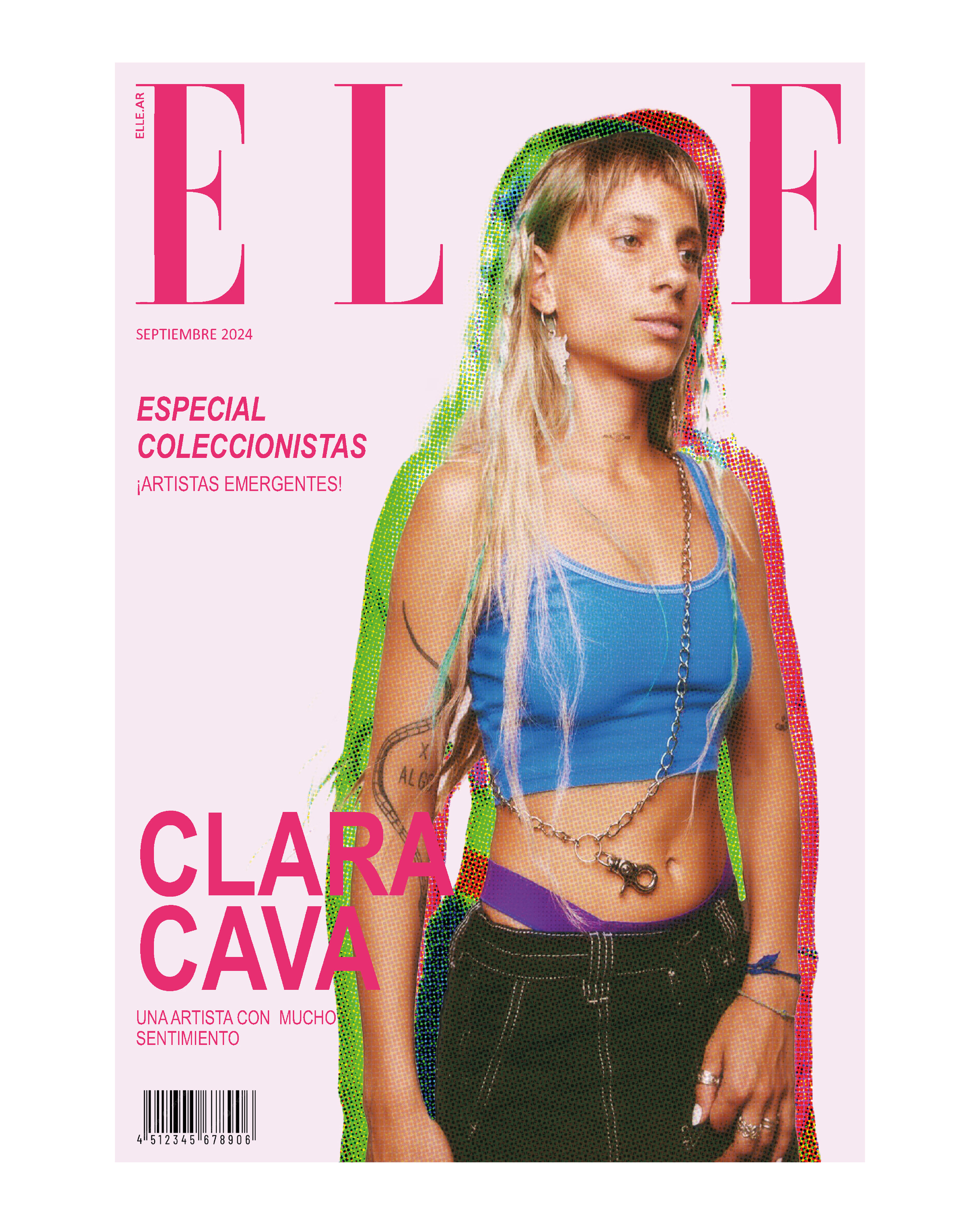
Editorial design project inspired by the Argentine artist Clara Cava.
The magazine offers a visual interpretation of her musical universe through color, typography, and composition.
It combines graphic analysis and layout design to build an identity that reflects the experimentation and sensitivity present in her work.
The magazine offers a visual interpretation of her musical universe through color, typography, and composition.
It combines graphic analysis and layout design to build an identity that reflects the experimentation and sensitivity present in her work.
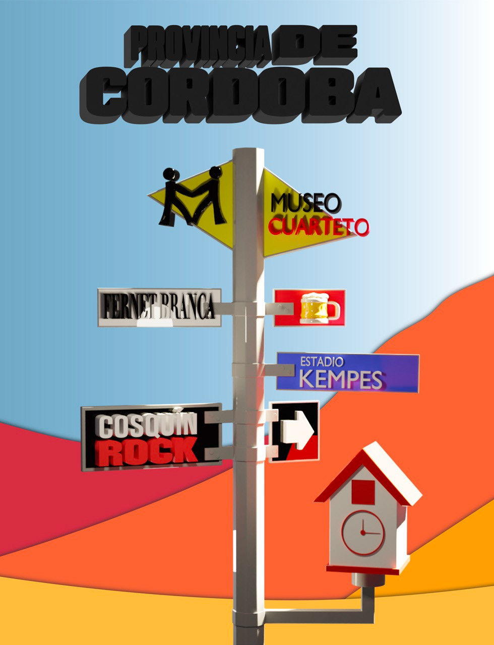
Three-dimensional composition inspired by the province of Córdoba, Argentina. The project combines graphic and volumetric elements to reinterpret icons from its landscape and culture, such as the Cuckoo Clock and the mountain colors. Based on the visual identity and graphic language of Córdoba’s official tourism website, it aims to convey the province’s essence from a contemporary perspective through digital modeling and lighting.
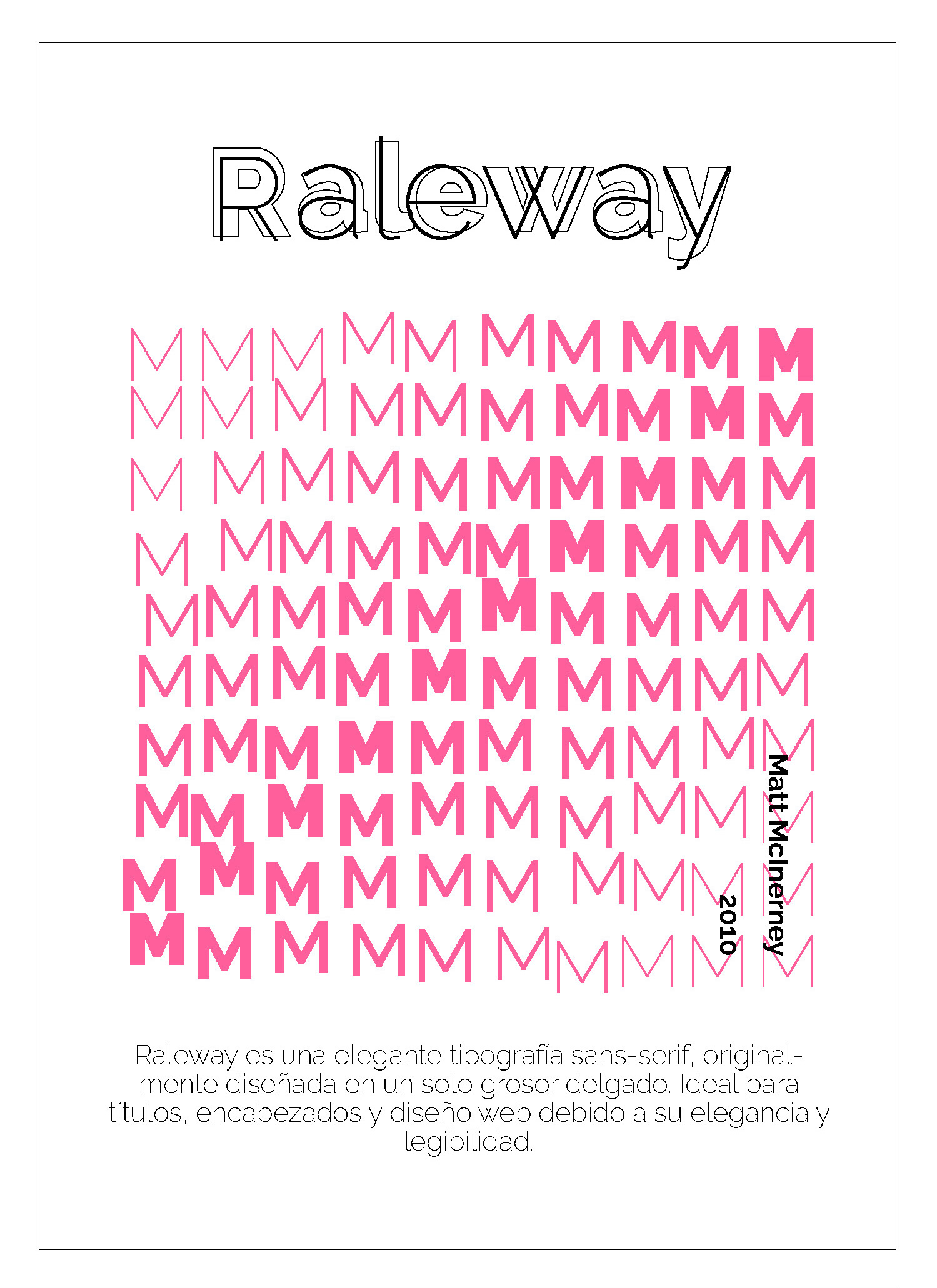
Series of experimental posters exploring the relationship between form, structure, and visual language through typography. Each piece combines composition, rhythm, and contrast to communicate ideas using the typographic sign as the main element.The project investigates how letters can transcend their textual function to become image and visual expression.
Three-dimensional composition inspired by the province of Córdoba, Argentina. The project combines graphic and volumetric elements to reinterpret icons from its landscape and culture, such as the Cuckoo Clock and the mountain colors. Based on the visual identity and graphic language of Córdoba’s official tourism website, it aims to convey the province’s essence from a contemporary perspective through digital modeling and lighting.
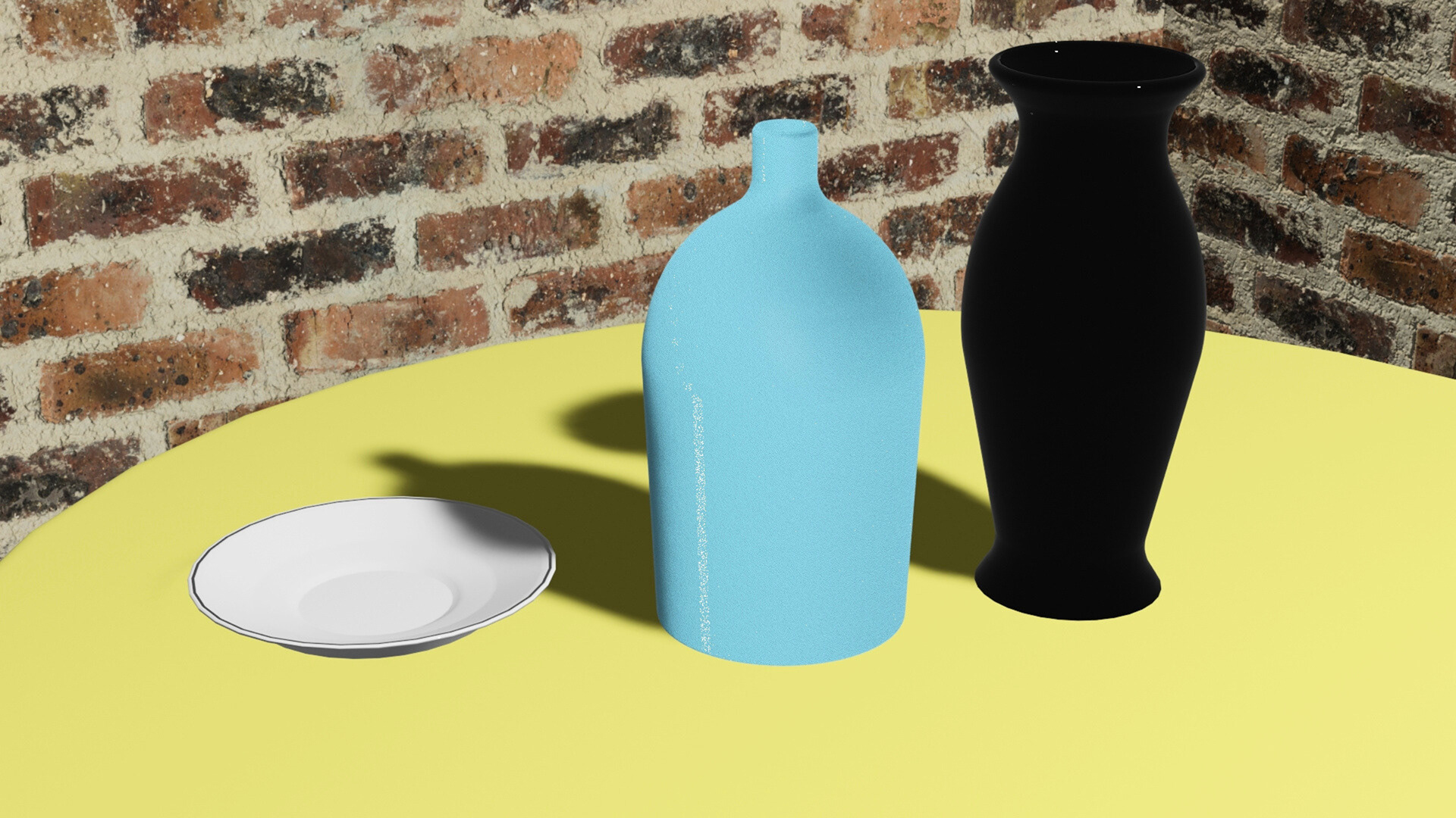
Exercise in observation, modeling, and digital lighting based on three everyday objects. The project aims to accurately reproduce the materiality, proportions, and lighting conditions of each element, exploring how environment and perspective transform their perception. It combines technique and composition to turn simple objects into visually expressive scenes.
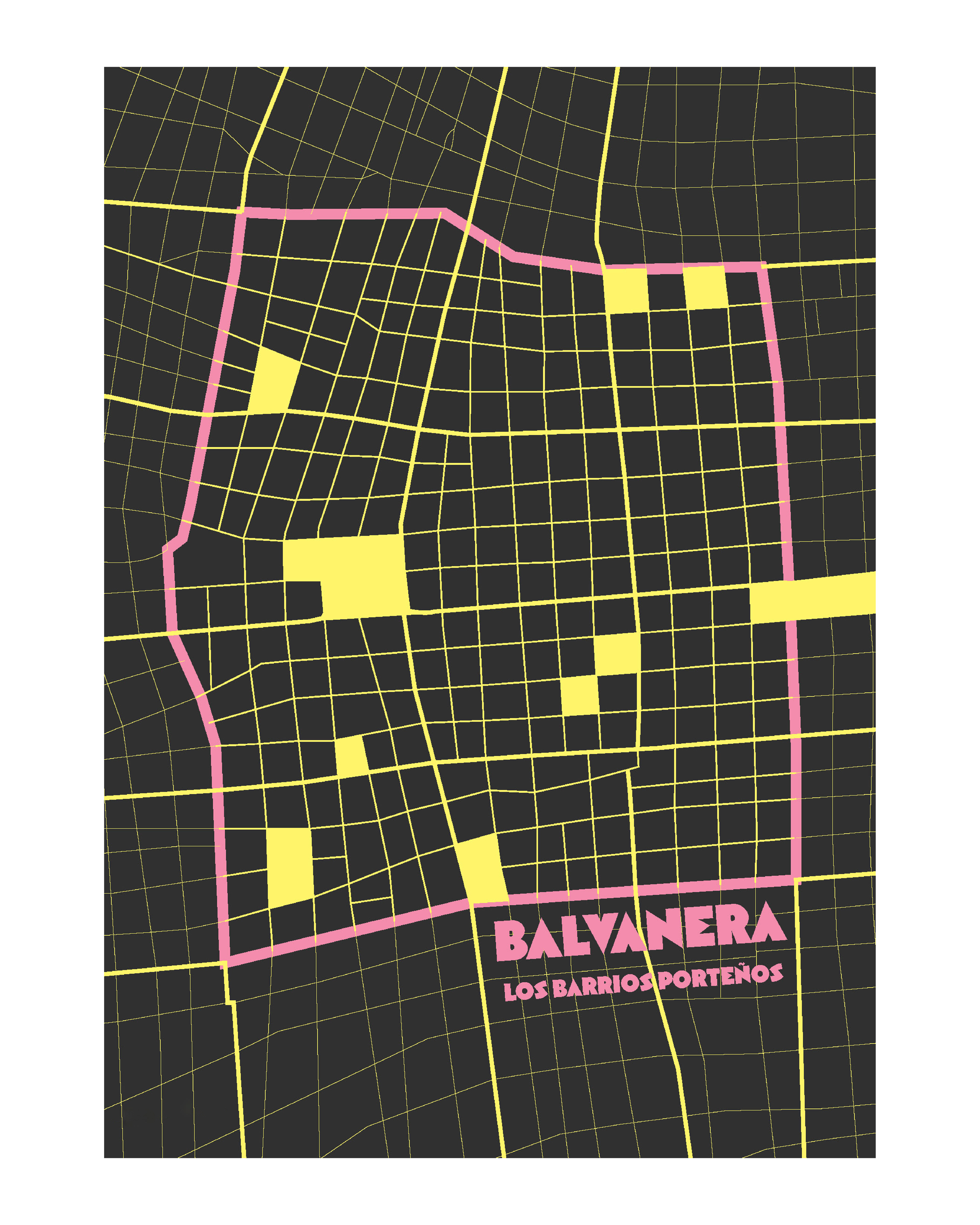
Design of the cover and back cover for a magazine inspired by the Buenos Aires neighborhood of Balvanera. The project draws from its visual identity, urban rhythm, and the cultural diversity that defines it. Through the use of color, typography, and composition, it aims to capture the everyday pulse of the neighborhood and its blend of history, movement, and local life.